UI: Titles
H1 to H6 title elements.
Examples
World’s first plastic-free aisle opens in Netherlands supermarket
Shoppers in the Netherlands will get the chance to visit Europe’s first plastic-free supermarket aisle on Wednesday in what campaigners claim is an turning point in the war on plastic pollution.
World’s first plastic-free aisle opens in Netherlands supermarket
Shoppers in the Netherlands will get the chance to visit Europe’s first plastic-free supermarket aisle on Wednesday in what campaigners claim is an turning point in the war on plastic pollution.
World’s first plastic-free aisle opens in Netherlands supermarket
Shoppers in the Netherlands will get the chance to visit Europe’s first plastic-free supermarket aisle on Wednesday in what campaigners claim is an turning point in the war on plastic pollution.
World’s first plastic-free aisle opens in Netherlands supermarket
Shoppers in the Netherlands will get the chance to visit Europe’s first plastic-free supermarket aisle on Wednesday in what campaigners claim is an turning point in the war on plastic pollution.
World’s first plastic-free aisle opens in Netherlands supermarket
Shoppers in the Netherlands will get the chance to visit Europe’s first plastic-free supermarket aisle on Wednesday in what campaigners claim is an turning point in the war on plastic pollution.
World’s first plastic-free aisle opens in Netherlands supermarket
Shoppers in the Netherlands will get the chance to visit Europe’s first plastic-free supermarket aisle on Wednesday in what campaigners claim is an turning point in the war on plastic pollution.
World’s first plastic-free aisle opens in Netherlands supermarket
Shoppers in the Netherlands will get the chance to visit Europe’s first plastic-free supermarket aisle on Wednesday in what campaigners claim is an turning point in the war on plastic pollution.
UI: Slider
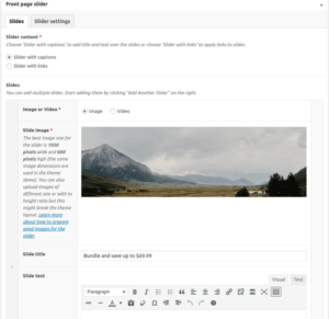
Slider is a page template which can be selected from the Page Attributes > Template menu. Once selected, the Front page slider meta box will be added above the Page Builder and there the slides can be added and the slider customized to fit your needs
Features
- Two types of the slider:
- With captions – for each slide, you can enter the title, custom text, buttons etc.
- With links – each slide image will a link to any URL you enter.
- Each slide can be:
- Image slide – default.
- Video slide – upon clicking on the slide, the video you define will open and start playing in the opened popup window.
- Recommended dimensions for slider images are 1920 x 600 px, but it will also accept images of different ratio and adapt accordingly.
- The slider settings can be folded so once the slider is configured it doesn’t take up space for editing of the rest of the page.
- Shortcodes (buttons, for example) can be used in the Slide text.
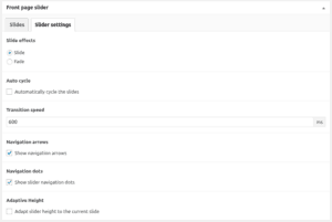
- Other settings:
- Slide effects – fade or slide.
- Auto cycle – either autoplay the slides or only advance on arrow click.
- Cycle interval – how much time each slide will be shown before advancing to the next.
- Transition speed – how much time it takes for the transition to complete.
- Navigation arrows – show (or not) left/right navigation arrows.
- Navigation dots – show (or not) navigation dots.
- Adaptive height – adapt slider height to the current slide.
- AI features:
- Large PLAY button overlay is automatically added for video slides.
- Swipe on touch screens will change the slide (swipe left for next, swipe right for previous).
- Adaptive height mode: slider will adapt during the transition for images of different height to be displayed in full.
- On touch screens (mobile, tablet) the navigation arrows will be shown all the time so it’s apparent that it’s a slider.
- On smaller screens, captions are moved below the slide images because there is very limited space available and we would have to sacrifice readability. To avoid bad UX practices, our theme slider provides captions below the slides on mobile and smaller tablets. We’ve written about it on our blog.
- Slider captions will be automagically vertically aligned to the center of the slide, regardless of the amount of content.
- Simply copy&paste a YouTube or Vimeo link and the video will be embedded automatically.
Screenshots of the settings
Examples
Slider example can be seen on the front page.
UI: Buttons
Buttons are used throughout the theme, but they are kept consistent. They can be used directly as HTML with classes or with the shortcode button.
Features
- Colors/types:
- Primary – class
btn btn-primary, shortcode attributestyle="primary" - Secondary – class
btn btn-secondary, shortcode attributestyle="secondary" - Success – class
btn btn-success, shortcode attributestyle="success" - Info – class
btn btn-info, shortcode attributestyle="info" - Warning – class
btn btn-warning, shortcode attributestyle="warning" - Danger – class
btn btn-danger, shortcode attributestyle="danger" - Light – class
btn btn-light, shortcode attributestyle="light" - Dark – class
btn btn-dark, shortcode attributestyle="dark" - Link – class
btn btn-link, shortcode attributestyle="link" - Each color has its outline counterpart, except Link – class
btn btn-outline-primary, shortcode attributestyle="outline-primary"
- Primary – class
- Sizes:
- Small – class
btn btn-sm, shortcode attributeclass="btn-sm" - Normal – default
- Large – class
btn btn-lg, shortcode attributeclass="btn-lg" - Block size – class
btn btn-block, shortcode attributeclass="btn-block"
- Small – class
- AI features:
- The text color in the button is automatically determined to be white or black depending on the type.
Examples
Colors
Outline Colors
Sizes
Block Sizes
Widget: Image Banner
Upload your photo and easily create a banner for your shop using the ProteusThemes Image Banner widget.
Features
- Fields:
- Title
- Subtitle
- Link (URL)
- Button text
- Settings:
- Text color (applies to the title, subtitle, and color of the CTA button)
- Text position:
- top left
- top center
- top right
- middle left
- middle center
- middle right
- bottom left
- bottom center
- bottom right
- Text size (applies to title and button size):
- small
- normal
- big
- Text container width:
- full width
- half width
- Picture (URL to the image)
- Link (URL for the CTA button)
- Checkbox to open a link in a new tab
- AI features:
- The text color in the button is automatically determined to be white or black depending on the Text color setting.
- If Button text field is left empty, there is no button but the whole banner is clickable.
- It’s using the aspect ratio of the image you upload and adapts to the space available and the screen size.
- Gets slightly darker on mouse over and the image is zommed in.
Examples
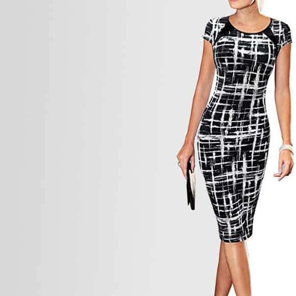

Different positions


Different sizes
Other variations

Widget: Instagram
Show latest images from your Instagram profile and engage your website visitors to follow you on social media with the CTA box feature.
Features
- Fields:
- Instagram access token (get it with a single click)
- Number of images
- CTA title
- CTA text
- CTA link (probably pointing to your Instagram profile)
- CTA icon (probably Instagram, but it can also be others)
- Settings:
- Show CTA box? (if this checkbox is checked, the additional CTA fields are shown – see above)
- AI features:
- Automatically places the CTA box in the best position for maximum engagement.
- The AI-powered layout that automatically fits the chosen number of images.
- ProteusThemes app which gets you an Instagram access token with a single click.
- Maximum performance:
- Crisp images on mobile and desktop (also for retina displays).
- Will not slow down your site.
- Lazy loaded with spinner loader.
Examples
Instagram widget without CTA box
6 images, no CTA box, inside the container.
Instagram widget with CTA box
8 images, CTA box, edge to edge layout.
 English
 Deutsch